bentearentsen@gmail.com
+4560516711
Peech is a Danish intimacy brand with a playful, progressive approach to pleasure. This packaging refresh reimagines how their products show up in the world—on shelves, in homes, and in culture. Designed to spark curiosity and normalize sexual wellness, the new system blends clarity with confidence, tactility with joy. It doesn’t hide away. It invites.
Role: Art Director, Graphic Designer
Client: Peech
Focus: Packaging and Brand Identity
Photographer: Maja Maria Aaby Christensen , Theis Mortensen
Client: Peech
Focus: Packaging and Brand Identity
Photographer: Maja Maria Aaby Christensen , Theis Mortensen


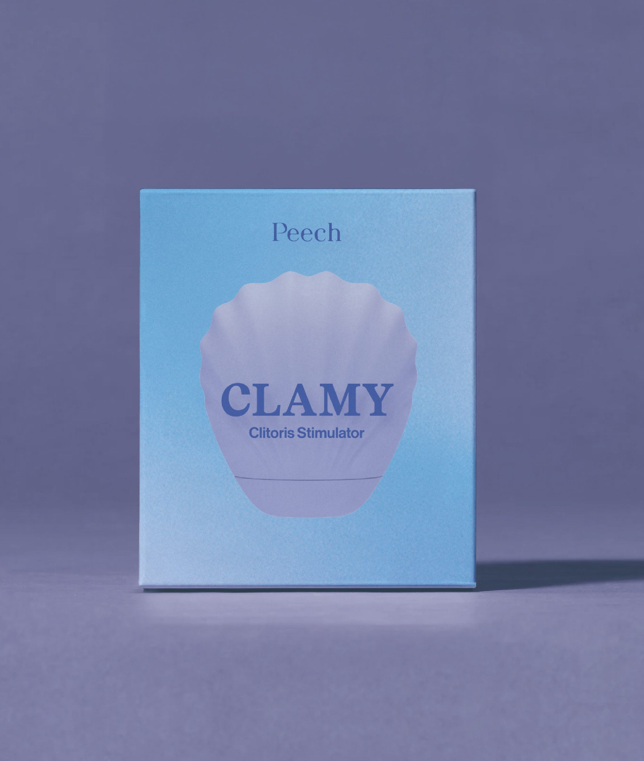
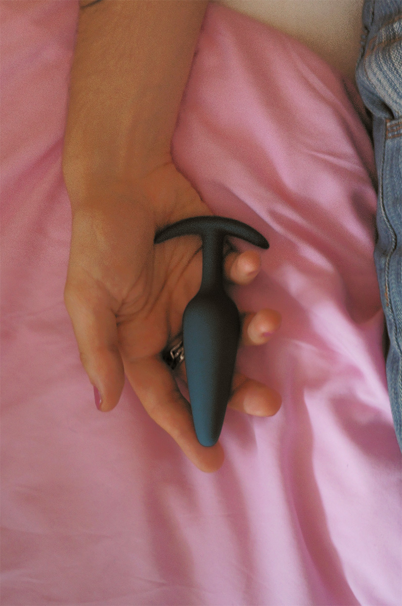
This packaging system was designed to change how people encounter sex toys—in stores, in homes, and in culture. From bold naming to shelf-friendly color stories, every element was created to normalize pleasure and spark curiosity. The products don’t hide; they invite. Whether placed in a fashion boutique, a concept pharmacy, or an everyday grocery store, they’re meant to be seen.
The new visual identity strikes a balance between extremes. It’s warm but precise, bold but never crass—living somewhere between intimacy and design-forward lifestyle branding. Each product was given a distinct name, tone of voice, and visual rhythm—crafted to be easily understood, remembered, and talked about.
Without final product photography or high-quality renders, we had to work within tight limitations. We used simple 3D models as a base, then built a stylized, textured look that felt tactile, nostalgic, and emotionally engaging—more like a visual memory than a sterile diagram. This treatment allowed us to show the products as they are, without masking or censoring them. It supports the brand’s mission to make sexual wellness feel open, unashamed, and beautifully normal.
Each element was designed to scale. A modular system made it possible to expand across dozens of product variants, languages, and formats—while keeping consistency and expression intact. We also created physical guides and inserts that mix nostalgic charm with clear, educational language. Together, the system offers a tactile, analog experience that complements Peech’s digital-first presence.
The result is a future-facing packaging system—one that makes space for play, comfort, and confident self-exploration. Where intimacy isn’t hidden, and where design helps people feel seen, curious, and in control.

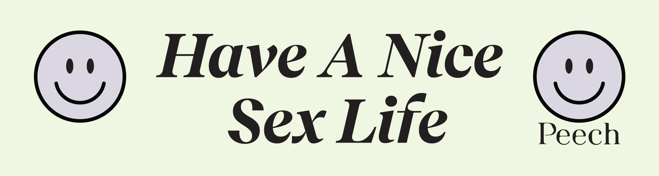
Each design reflects Peech's core values: education, body and sex inclusivity and encouragement, humor and community. The designs go beyond being playful—they foster a sense of community and carry a deeper message, making them impactful beyond their surface appeal.
Each design reflects Peech's core values: education, body and sex inclusivity and encouragement, humor and community. The designs go beyond being playful—they foster a sense of community and carry a deeper message, making them impactful beyond their surface appeal.

Relatable and Provocative: Designs that push boundaries with humor
and bold statements, encouraging open dialogue about intimacy.
and bold statements, encouraging open dialogue about intimacy.
 Products/Promotion: Eye-catching designs that spotlight Peech’s products with creativity.
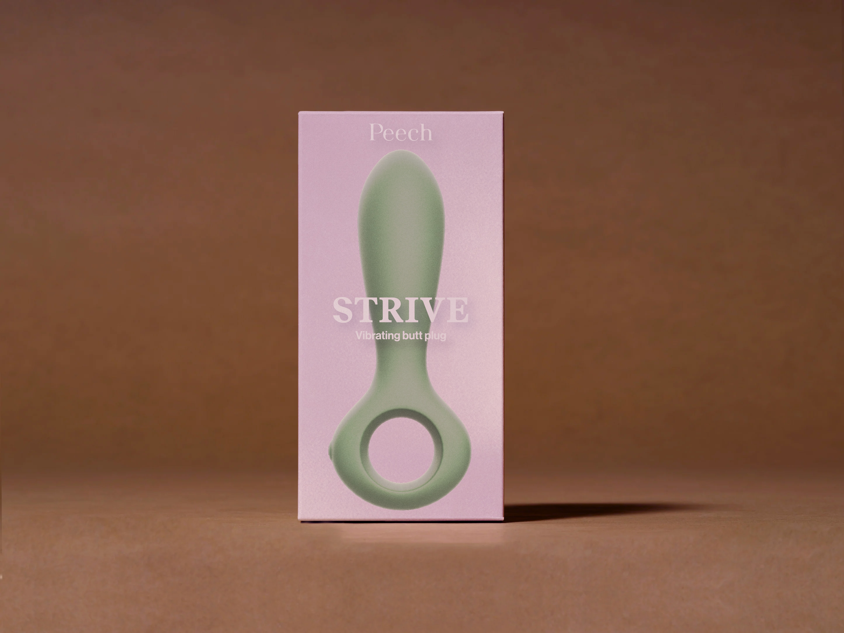
Love and Care: Gentle reminders that tie intimacy to acts of love, self-care, and empathy.

 Educational: Stickers that subtly teach and normalize conversations about sexual wellness.
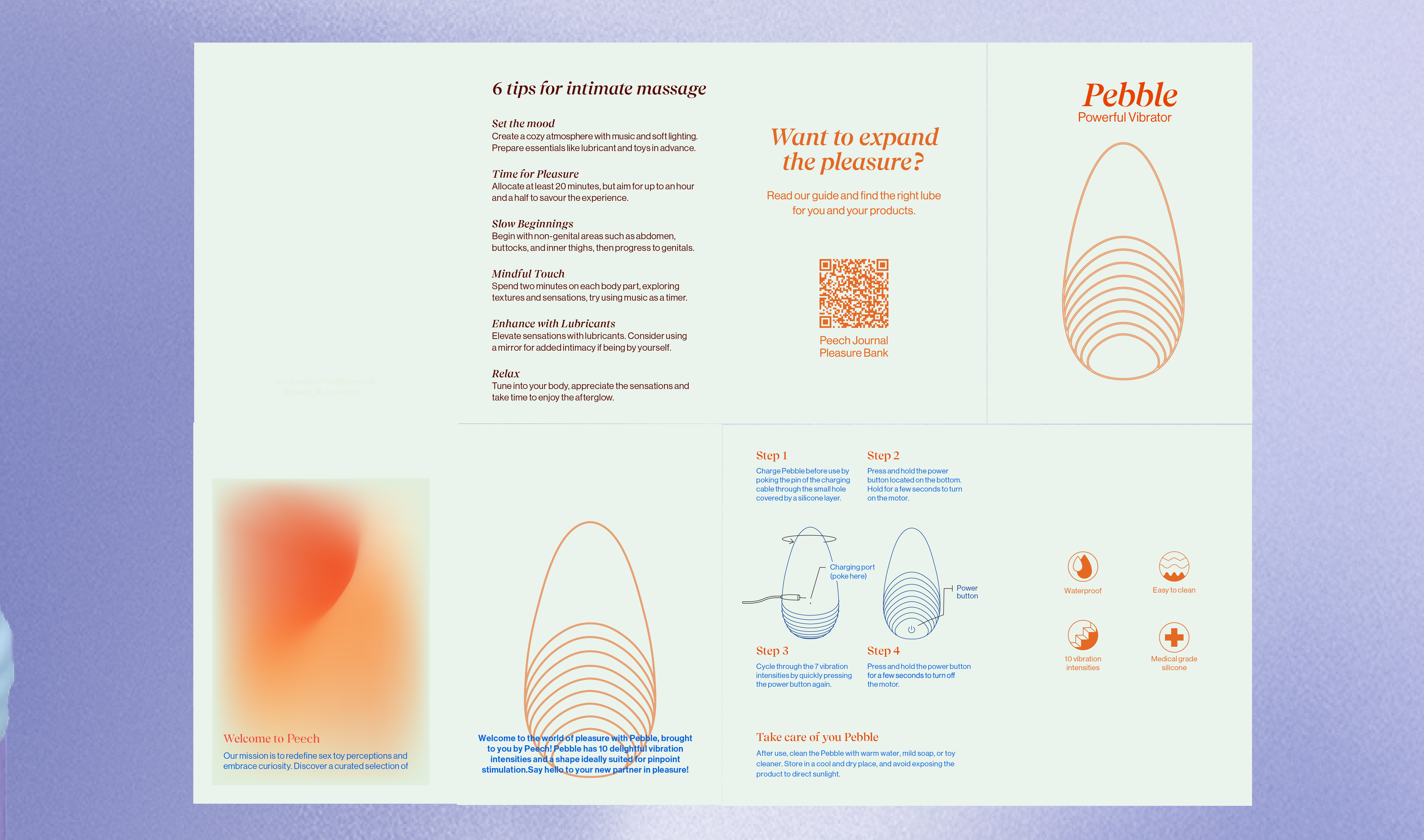
These designs have the flexibility to expand onto other products like mugs, t-shirts, and more, amplifying the brand’s presence while fostering meaningful connections with its community.